使用 HT for Web (以下简称 HT)开发有 Chart 需求的项目的时候,感觉很痛苦,HT 集成的 Chart 组件中,并不包含有坐标,在展现方面不是很直观,但是也不是没有解决方案,接下来我们就来聊聊具体的解决方案。
首先,第一种解决方案是,在定义 Chart 矢量的时候在 comps 中除了定义 Chart 外,再添加几个你自定义的绘制区域来绘制你想要的坐标轴,效果及 example 如下:
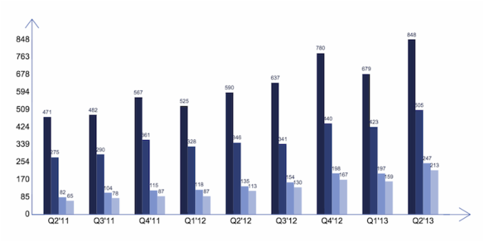
该 Chart 的定义代码见附录1(代码的定义太长),代码虽然长,但是代码的逻辑并不乱,各个模块间的矢量描述还是比较清晰的,具体可以参考 HT 的矢量手册,看到如此长的代码,我自己都没信心去维护它,维护这样的代码纯粹是体力活,而且复用性也不高,每一个不同的 Chart 都要类似如此地绘制,绘制一两个这样的图表感觉还好,绘制多了,真心会感觉很恶心,再这上面很浪费时间。
其次,第二种解决方案是,通过数据绑定来自定义绘制坐标轴。实现以上相同效果,其代码见附录2。可以明显看出其代码量会比第一种解决方案好很多,而且代码可以复用。在其他的图表中,可以将横轴和纵轴的文本内容设置到 data 的 attr 属性上,并在定义 chart 时使用上如下代码就可以实现坐标文本的效果:
ht.Default.setImage('chartName', {
  width: Number,
  height: Number,
  comps: [
    {
      // define chart
    },
    {
      type: 'xAxis',
      rect: Array
    },
    {
      type: 'yAxis',
      rect: Array
    }
  ]
});
在这里我已经通过 ht.Default.setCompType(‘typeName’, function(g, rect, comp, data, view){}) 的方法定义了名字为 xAxis 和 yAxis 的 CompType ,这两个 CompType 分别绘制了横轴和纵轴的坐标文本,代替了第一种方案制定多个 CompType 为 text 的写法,稍微优化了下代码,提高代码的可维护性。
但是,这样但使用方法总刚觉有些别扭,明明坐标轴是 Chart 的一部分,在定义 Chart 上却要硬生生地将图表和坐标部分分开,那如果用户还要在定义标题、坐标刻度、坐标说明等需求,那这个方案还是无法爽快的解决大部分通用的需求,需要定义许多 CompType 来渲染不同的需求,而且在使用上也不是那么爽快。接下来要说明的方案三,就是来解决使用上及维护上的问题。
最后,第三种解决方案是,和第二种解决方案差不多,都是通过 ht.Default.setCompType(‘typeName’, function(g, rect, comp, data, view){}) 的方法来定义名字为 axisChart 的 CompType,不同的是,数据并不是设置到 data 中,而是在 ht.Default.setImage() 的 comps 中直接定义其相关属性。具体的配置属性说明及其具体的代码实现可以 查看附件 ,使用方式很简单,在引入 ht.js 核心文件的前提下,引入附件1的 axisChart.js 文件即可。
接下来来看下 axisChart 的具体使用及几个简单的例子:
例1:设计同一时刻不同小区之间的电流电压情况的柱状图柱状图:

代码如下:
ht.Default.setImage('c1', {
  width: 600,
  height: 400,
  comps: [
    {
      type: 'axisChart',
      rect: [0, 0, 600, 400],
      yAxis: [
        {
          name: '单位:V',
          max: 270,
          min: 150,
          splitNumber: 10,
          axisTitle: {
            text: '电压',
            rotate: -90
          },
          axisLine: {
            arrow: true
          }
        },
        {
          position: 'right',
          name: '单位:I',
          max: 20,
          splitNumber: 20,
          axisTitle: {
            text: '电流',
            rotate: 90
          },
          axisLabel: {
            interval: 1
          },
          axisLine: {
            arrow: true
          }
        }
      ],
      xAxis: [
        {
          type: 'category',
          data: ['抚梅源', '藕花深处', '紫东花园', '紫金苑', '华府山水', '水云间', '瑞景新城'],
          axisTitle: {
            text: '小区名称'
          }
        }
      ],
      series: [
        {
          label: function(value){
            return value + ' V';
          },
          data: {
            values: [220, 210, 200, 209, 230, 215, 218],
            color: '#f90'
          }
        },
        {
          yAxisPosition: 'right',
          label: true,
          data: {
            values: [10, 4, 15, 9, 12, 18, 7],
            color: '#af0'
          }
        }
      ]
    }
  ]
});
例2: 不同时刻,不同小区的电压情况的折线图:

代码如下:
ht.Default.setImage('c2', {
  width: 600,
  height: 400,
  comps: [
    {
      type: 'axisChart',
      rect: [0, 0, 600, 400],
      yAxis: [
        {
          name: '单位:V',
          max: 240,
          min: 190,
          splitNumber: 10,
          axisTitle: {
            text: '电压',
            rotate: -90
          },
          axisLine: {
            arrow: true
          }
        }
      ],
      xAxis: [
        {
          type: 'time',
          min: new Date(2015, 0, 1),
          max: new Date(2015, 0, 2),
          splitNumber: 25,
          axisTitle: {
            text: '时间'
          },
          axisLabel: {
            interval: 2,
            formatter: function(value, index, min, max){
              return value.format('dd-hh');
            }
          },
          axisLine: {
            arrow: true
          }
        }
      ],
      series: [
        {
          type: 'line',
          data: {
            values: [220, 210, 200, 209, 230, 215, 218, 220, 210, 200, 209, 230, 215, 218, 209, 230, 215, 218, 220, 210, 200, 209, 230, 215, 218],
            color: '#f90'
          }
        },
        {
          type: 'line',
          data: {
            values: [225, 209, 208, 206, 205, 221, 213, 224, 218, 224, 205, 208, 216, 220, 208, 210, 219, 219, 210, 209, 219, 207, 222, 222, 215],
            color: '#7d0'
          }
        },
        {
          type: 'line',
          linePoint: true,
          line3d: true,
          data: {
            values: [211, 216, 215, 205, 206, 206, 223, 217, 217, 215, 212, 221, 219, 222, 205, 208, 205, 218, 223, 222, 207, 215, 215, 222, 223],
            color: '#ab0'
          }
        }
      ]
    }
  ]
});
最后,还有一点要说明,axisChart 的代码并不是那么的无懈可击,我个人觉得代码设计上还是有些欠缺,所有的代码总共有差不多 1000 行,我觉得太臃肿了,在设计上自己也感觉不是那么的友好,等想修改的时候发现已经投入太多时间了,还有好多事情等待着我我去学习、去探讨,所以也就线这样吧,等有空了再重构一番,但是我相信在功能上还是能够满足大部分的需求,在设计上,或者是实现的方法上,还是在使用过程中发现的 bug,还望大家能够不吝赐教。
附录1
ht.Default.setImage('chart', {
  width: 650,
  height: 380,
  comps: [
    // column chart
    {
      type: 'columnChart',
      rect: [10, 60, 630, 260],
      label: true,
      labelColor: '#20284C',
      labelFont: '8px Arial',
      series: [
        {
          color: '#20284C',
          values: [471, 482, 567, 525, 590, 637, 780, 679, 848]
        },
        {
          color: '#303F74',
          values: [275, 290, 361, 328, 346, 341, 440, 423, 505]
        },
        {
          color: '#7E93CD',
          values: [82, 104, 115, 118, 135, 154, 198, 197, 247]
        },
        {
          color: '#A9B6DB',
          values: [65, 78, 87, 87, 113, 130, 167, 159, 213]
        }
      ]
    },
    // 竖线
    {
      type: 'rect',
      rect: [15, 60, 1, 260],
      background: '#566CB0'
    },
    {
      type: 'shape',
      rect: [5.5, 30, 20, 30],
      borderWidth: 1,
      borderColor: '#566CB0',
      points: [0, 20 / 3 * 2, 20 / 2, 0, 20, 20 / 3 * 2, 20 / 2, 0, 20 / 2, 30],
      segments: [1, 2, 2, 1, 2]
    },
    // 坐标文本
    {
      type: 'text',
      rect: [0, 320 - 26 * 10 - 8, 15, 16],
      align: 'right',
      text: Math.round(84.8 * 10)
    },
    {
      type: 'text',
      rect: [0, 320 - 26 * 9 - 8, 15, 16],
      align: 'right',
      text: Math.round(84.8 * 9)
    },
    {
      type: 'text',
      rect: [0, 320 - 26 * 8 - 8, 15, 16],
      align: 'right',
      text: Math.round(84.8 * 8)
    },
    {
      type: 'text',
      rect: [0, 320 - 26 * 7 - 8, 15, 16],
      align: 'right',
      text: Math.round(84.8 * 7)
    },
    {
      type: 'text',
      rect: [0, 320 - 26 * 6 - 8, 15, 16],
      align: 'right',
      text: Math.round(84.8 * 6)
    },
    {
      type: 'text',
      rect: [0, 320 - 26 * 5 - 8, 15, 16],
      align: 'right',
      text: Math.round(84.8 * 5)
    },
    {
      type: 'text',
      rect: [0, 320 - 26 * 4 - 8, 15, 16],
      align: 'right',
      text: Math.round(84.8 * 4)
    },
    {
      type: 'text',
      rect: [0, 320 - 26 * 3 - 8, 15, 16],
      align: 'right',
      text: Math.round(84.8 * 3)
    },
    {
      type: 'text',
      rect: [0, 320 - 26 * 2 - 8, 15, 16],
      align: 'right',
      text: Math.round(84.8 * 2)
    },
    {
      type: 'text',
      rect: [0, 320 - 26 * 1 - 8, 15, 16],
      align: 'right',
      text: Math.round(84.8 * 1)
    },
    {
      type: 'text',
      rect: [0, 320 - 8, 15, 16],
      align: 'right',
      text: 0
    },
    // Q
    {
      type: 'text',
      rect: [55, 322, 0, 16],
      align: 'center',
      text: 'Q2\'11'
    },
    {
      type: 'text',
      rect: [124, 322, 0, 16],
      align: 'center',
      text: 'Q3\'11'
    },
    {
      type: 'text',
      rect: [191, 322, 0, 16],
      align: 'center',
      text: 'Q4\'11'
    },
    {
      type: 'text',
      rect: [259, 322, 0, 16],
      align: 'center',
      text: 'Q1\'12'
    },
    {
      type: 'text',
      rect: [327, 322, 0, 16],
      align: 'center',
      text: 'Q2\'12'
    },
    {
      type: 'text',
      rect: [394, 322, 0, 16],
      align: 'center',
      text: 'Q3\'12'
    },
    {
      type: 'text',
      rect: [462, 322, 0, 16],
      align: 'center',
      text: 'Q4\'12'
    },
    {
      type: 'text',
      rect: [529, 322, 0, 16],
      align: 'center',
      text: 'Q1\'13'
    },
    {
      type: 'text',
      rect: [596, 322, 0, 16],
      align: 'center',
      text: 'Q2\'13'
    },
    // line
    {
      type: 'rect',
      rect: [15, 320, 620, 1],
      background: '#566CB0'
    },
    {
      type: 'shape',
      rect: [635, 310.5, 30, 20],
      borderWidth: 1,
      borderColor: '#566CB0',
      points: [20 / 3 * 2, 0, 30, 20 / 2, 20 / 3 * 2, 20, 30, 20 / 2, 0, 20 / 2],
      segments: [1, 2, 2, 1, 2]
    }
  ]
});
附录2
ht.Default.setCompType('yAxis', function(g, rect, comp, data, view) {
  var labels = data.a('yLabels'),
      len = labels.length,
      x = rect.x,
      y = rect.y,
      w = rect.width,
      h = rect.height,
      dh = h / (len - 1);
  g.save();
  g.font = '12px arial, sans-serif';
  g.fillStyle = 'black';
  g.textAlign = 'right';
  for(var i = 0; i < len; i++){
    g.fillText(labels[i], x, y);
    y += dh;
  }
  g.restore();
});
ht.Default.setCompType('xAxis', function(g, rect, comp, data, view) {
  var labels = data.a('xLabels'),
      len = labels.length,
      x = rect.x,
      y = rect.y,
      w = rect.width,
      h = rect.height,
      dw = w / (len * 3 + 1),
      dw3 = 3 * dw;
  x += dw * 2;
  g.save();
  g.font = '12px arial, sans-serif';
  g.fillStyle = 'black';
  g.textAlign = 'center';
  for(var i = 0; i < len; i++){
    g.fillText(labels[i], x, y);
    x += dw3;
  }
  g.restore();
});
ht.Default.setImage('chart1', {
  width: 650,
  height: 380,
  comps: [
    // column chart
    {
      type: 'columnChart',
      rect: [10, 60, 630, 260],
      label: true,
      labelColor: '#20284C',
      labelFont: '8px Arial',
      series: [
        {
          color: '#20284C',
          values: [471, 482, 567, 525, 590, 637, 780, 679, 848]
        },
        {
          color: '#303F74',
          values: [275, 290, 361, 328, 346, 341, 440, 423, 505]
        },
        {
          color: '#7E93CD',
          values: [82, 104, 115, 118, 135, 154, 198, 197, 247]
        },
        {
          color: '#A9B6DB',
          values: [65, 78, 87, 87, 113, 130, 167, 159, 213]
        }
      ]
    },
    // 竖线
    {
      type: 'rect',
      rect: [15, 60, 1, 260],
      background: '#566CB0'
    },
    // 向上的箭头
    {
      type: 'shape',
      rect: [5.5, 30, 20, 30],
      borderWidth: 1,
      borderColor: '#566CB0',
      points: [0, 20 / 3 * 2, 20 / 2, 0, 20, 20 / 3 * 2, 20 / 2, 0, 20 / 2, 30],
      segments: [1, 2, 2, 1, 2]
    },
    // 坐标文本
    {
      type: 'yAxis',
      rect: [12, 60, 15, 260]
    },
    // Q
    {
      type: 'xAxis',
      rect: [10, 330, 630, 16]
    },
    // line
    {
      type: 'rect',
      rect: [15, 320, 620, 1],
      background: '#566CB0'
    },
    // 向右的箭头
    {
      type: 'shape',
      rect: [635, 310.5, 30, 20],
      borderWidth: 1,
      borderColor: '#566CB0',
      points: [20 / 3 * 2, 0, 30, 20 / 2, 20 / 3 * 2, 20, 30, 20 / 2, 0, 20 / 2],
      segments: [1, 2, 2, 1, 2]
    }
  ]
});

 微信扫一扫,打赏作者吧~
转载请注明:苏demo的别样人生 » 矢量Chart图表嵌入HTML5网络拓扑图的应用